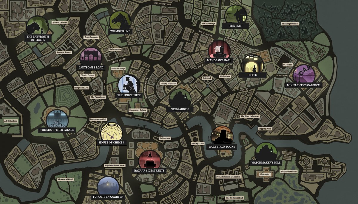
Fallen London’s map used to be a flat, 2D, top-down view of the game’s weirdly esoteric version of the UK capital. A sort of Victoriana Google maps, with a few key locations marked.
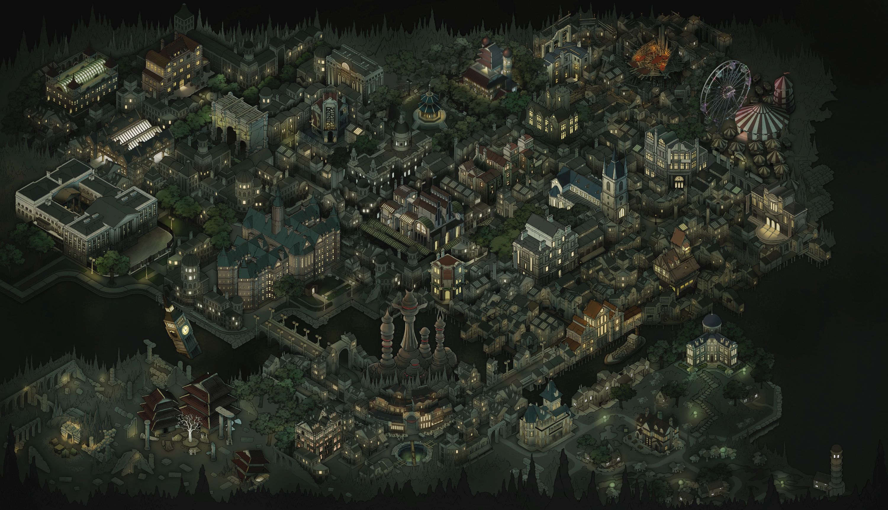
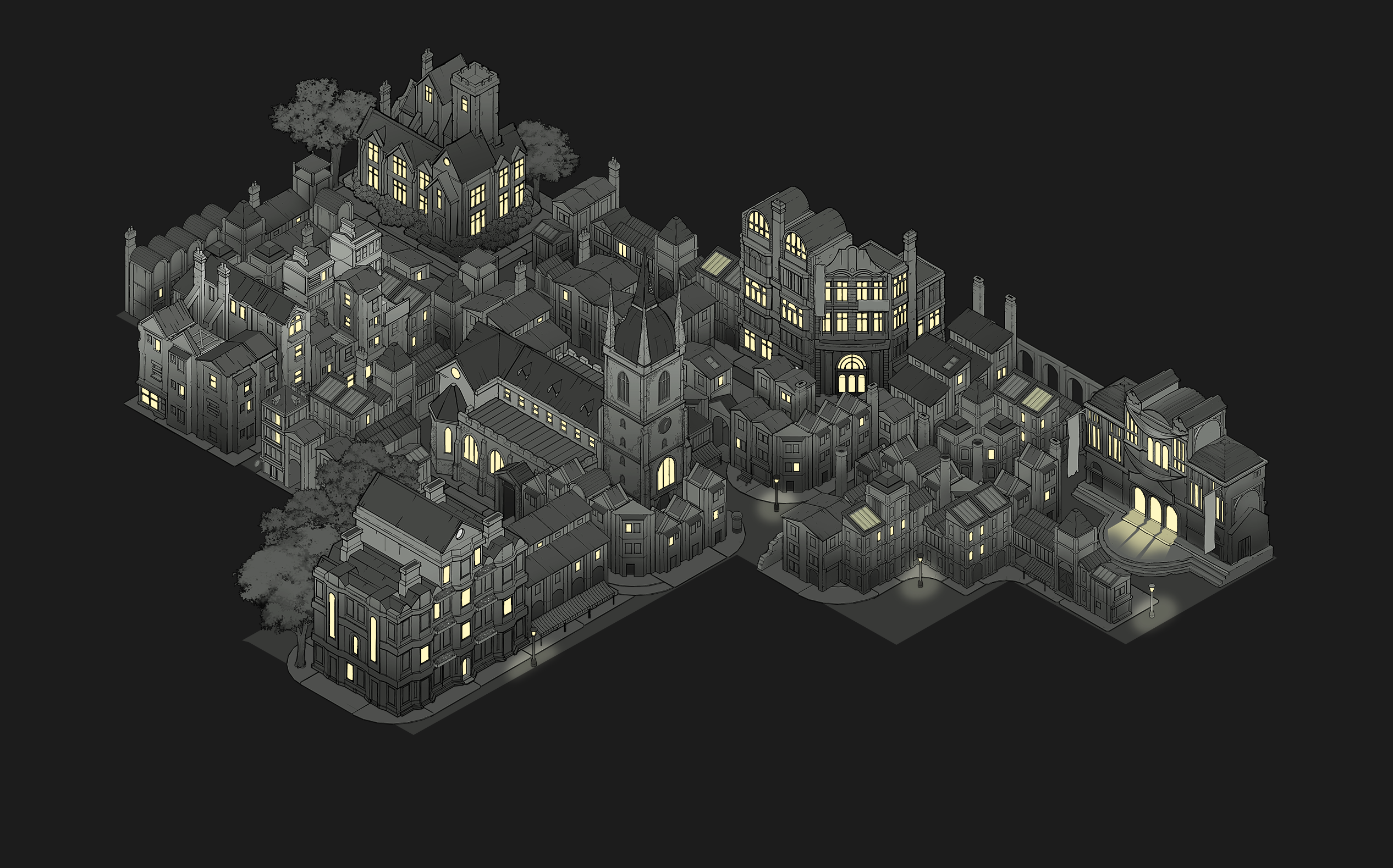
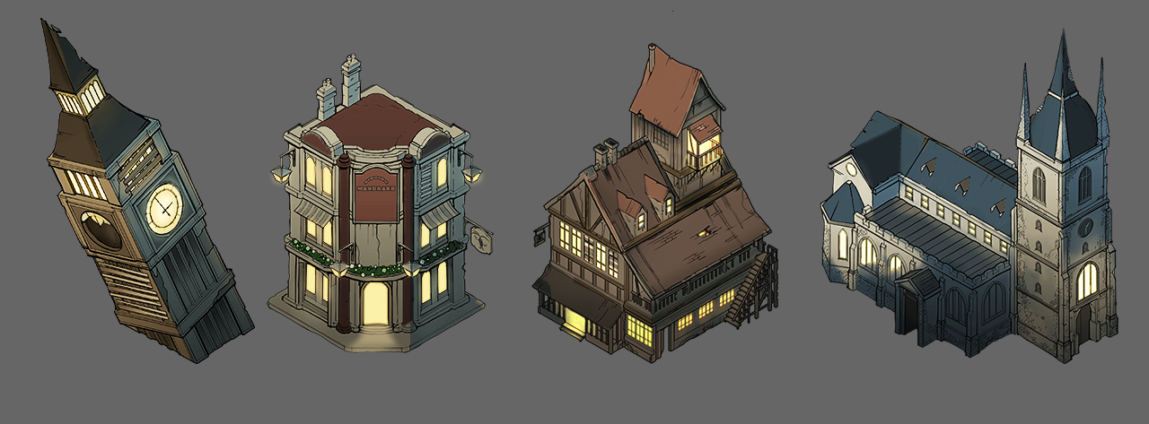
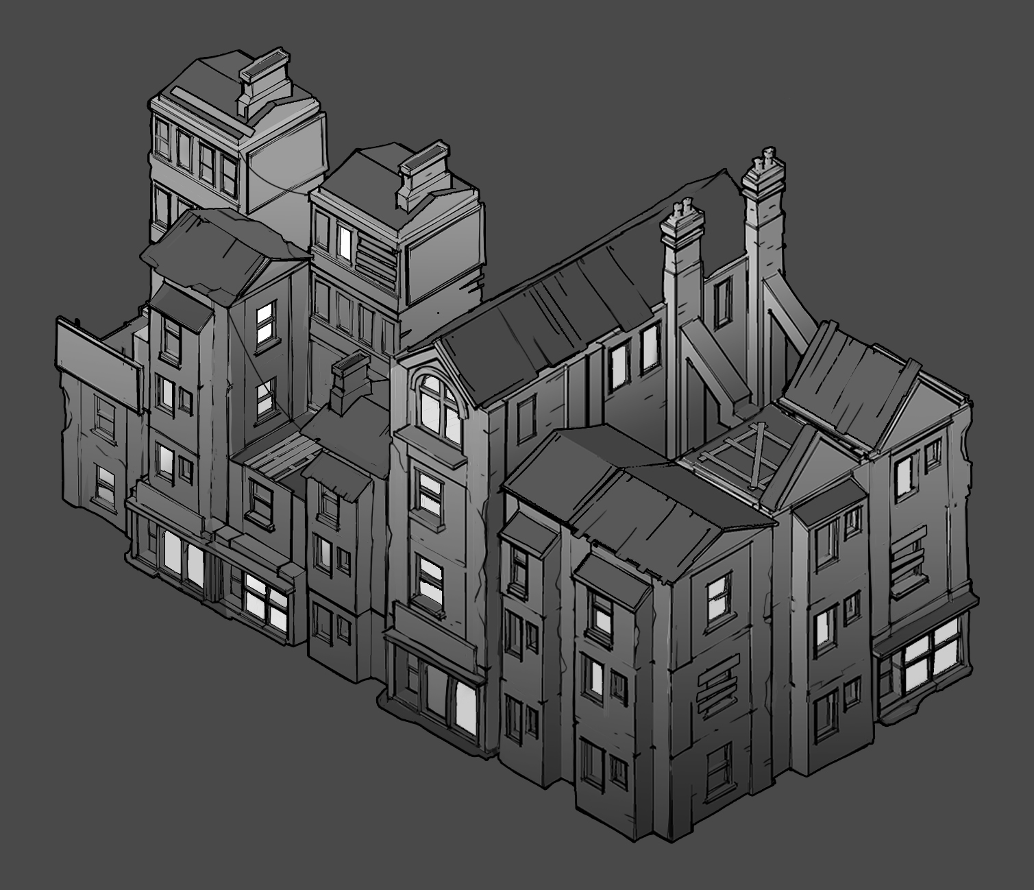
But after dedicated toil by art director Paul Arendt and artist Tobias Cook, it’s been transformed into a detailed isometric wonder, filled out with depictions of specific buildings. Areas you can’t reach yet are greyed out, while new buildings are suddenly presented to you as you discover routes to them. You can zoom in and out and everything. It’s quite a change, and the map is now the most modern part of the whole FL site.
“To try and pin down the space geographically is a bit of a nightmare,” Arendt explained to me, when he showed me the in-progress artwork a few months ago. Arendt is a calming, broad-shouldered presence in Failbetter’s office, much given to sitting with his arms comfortably folded, and he’s been at the studio since its inception. “We’ve had a few goes at it,” he added - and no wonder. Over the years, the game’s writers have added location after location, meaning a never-ending programme of urban renewal for the theoretical city.
Fallen London is roughly analogous to London London. Bits are broadly in the right places compared with their real world counterparts, and are often “cheap jokes” - Ladybones Road for Marylebone, Spite for Spitalfields, and Wolfstack Docks for the Isle Of Dogs (though Arendt said that in his very first version he put Ladybones Road in East London, not knowing anything about how the city was laid out). Failbetter can cheat a bit when it comes to location, though, with the handy excuse that things got moved around when the whole city was dragged underground. By bats. It’s one of the reasons Arendt has always been against putting any representations of human scale in the games, in fact, as he feels “it reinforces how much we cheat.”
Arendt explained that for the studio’s 10th anniversary they wanted to do something fun, and also make the map more interactive and interesting, feeling more like a part of the game. “So in a moment of madness, I said ‘Why don’t we do this isometric?’. Because honestly I’m so bored of drawing roofs. It’s been, like, five years now. Sunless Sea, Sunless Skies, nothing but roofs,” he added, with a genial chuckle. “I really wanted to draw a window and a wall.”
Arendt came to art late enough in life - about ten years ago, in fact. “I was doodling and drawing pictures all my life but I was a journalist for years and years, and just fell into this by accident,” he said. The accident was Failbetter. Someone needed to do the art, so Arendt done did it. The first drawing he did for Fallen London was the very first version of the Exceptional Hat, a shiny black topper with eyes and fangs. “I didn’t even have a tablet at that point. I just did it on tracing paper and scanned it.”
Over the years, a lot of his earlier drawings and icons for Fallen London have been replaced with updated ones, though Arendt said that “there’s one really horrible one that’s still there…”. But the fact his hand has been on the art tiller since the start means Failbetter has had a consistent throughline in its style. When challenged, communications director Hannah Flynn was unable to tell the difference between buildings Arendt had drawn, and ones drawn by Cook - which Arendt pointed out was one reason why Cook was such a good hire.
It took each of them about half a day per building, with the buildings themselves being divided up between them. They were drawn in 3D modelling software Sketchup, which Arendt described as “a terrible programme for any kind of serious game, really, but great for exactly what I need it for - which is isometric 3D architecture.” The models were then exported and painted, saving “a lot of fucking about with perspective.” Arendt said that isometric illustration is “really magic”, and fun once you get into it, doing all sorts of things that regular drawing can’t.
“It sounds incredibly obvious with hindsight, but if you take any element of an iso illustration,” - here he mimed moving buildings around on the table in front of him - “if I was to take one of these buildings here and put it there, it would work fine. Which is why it’s such a big deal for games, because it just makes it all vastly easier.” Something drawn in perspective forces each house to remain in the spot it was drawn in, meaning nothing can be moved without being at least partly redrawn. With isometric drawing, however, you can even flip the art horizontally, and it still works. “You flip stuff vertically and it stops making any sense whatsoever, though,” Arendt cautioned me.
The other problem with drawing Fallen London is the inherent weirdness of the game. There are 34 visit-able locations in the city, not counting locations in other places - such as those out on the Unterzee, the underground ocean. But Fallen London has plenty of metaphysical locations, like “death” or “scandal” or “the mind of a long dead god”, which are all places players can physically be in. For the new map, Arendt and Cook have stuck to the physical. However, some metaphysical locations have a physical element to them, like, for example, “a state of some confusion”, which takes you to the Royal Bethlehem Hotel.
The Echo Bazaar was “an interesting one”, Arendt said, because it’s a building that’s sort of alive. It’s been party to a lot of different descriptions over the years that Fallen London has existed, and has been seen already in Sunless Sea (where the top-down view rendered it “basically a series of circles”). “Working out what it was going to look like was weird,” Arendt said, and it’s ended up being a series of differently shaped, slightly alien-looking towers, entirely different to all the other buildings.
“A lot of the stuff is not very concretely visualised,” said Arendt. “Deliberately so, because nailing down too much can damage them. But the ones that have been really hard [to draw] are the ones we haven’t done yet, because I’m putting them off ’til last.” At the time of the interview this included the Labyrinth Of Tigers (aka London Zoo), because “London Zoo doesn’t look like anything; it’s just a park with a bunch of stuff in it.” At the same time, Arendt is clearly very proud of what they’ve done with the map. At one point, he zoomed in to point out where the train tracks were going to go in a station. “Look at the little chairs!” he said, cooing over the tiny furniture outside a tiny pub. “I’m not sure they’re period appropriate, though…”
“Also,” Arendt concluded, with a chuckle, “I totally gave the really hard ones to Toby. I gave him Buckingham Palace, because I just couldn’t be arsed with all the windows.”
Disclosure: our reviews editor Nate was once the recipient of a Fundbetter grant from the studio’s now defunct funding scheme. I was given a kitkat when I visited their studio, and one time I had lunch with Hannah Flynn in Brighton.
